Creative Director | Art Direction | Production | Post
PureGym was entering the US market and needed to establish itself as the local 24/7 gym with premium equipment and an approachable community feel. With no voiceover, no big campaign idea, a limited budget, and real gym members instead of professional talent, the challenge was to create authentic content that could work across social, paid, CRM, web, in-gym, and OOH.
I led casting, art direction, production, music selection, and post while creating multiple :15 and :06 edits and a flexible content system that proved strong creative can drive awareness, even with limited resources.
Creative Director | Art Direction | Production | Post
Blink Fitness wanted a fresh campaign that would feel more elevated while embracing the themes of lifting each other up, uniting diverse cultures, and celebrating self-discovery and fitness victories. Partnering with Heart & Hustle, we crafted a cinematic campaign that showcases a variety of bold individuals, each portrayed in both their professional attire and workout gear, seamlessly blending their everyday lives with their fitness journeys.
Creative Director | Art Direction
Inclusivity is at the heart of Blink. From the beginning, we knew one thing for sure: Blink makes every body (with a space to emphasize BODY) feel welcome. And it goes beyond physical bodies. Blink embraces every unique individual for who they are in a clever, fun, and genuinely human way.
To bring that message to life in our OLV awareness video, we cast real Blink members to keep the story authentic and true to the brand. Working with a small budget, we focused on thoughtful, resourceful storytelling that proves real people and real stories are often the most powerful way to connect.
And just by showing everybody that we’re the gym for every body, our new site image increased site conversion by 23%!
Creative Director | Art Direction
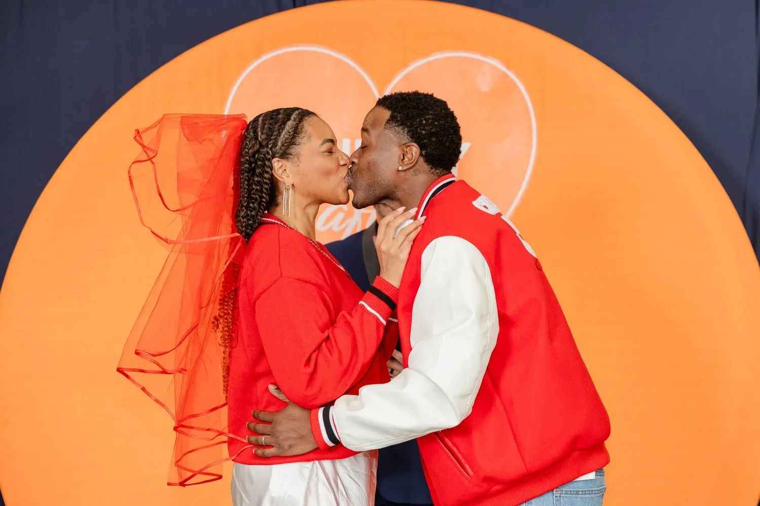
Our small creative team discovered that couples who work out together report stronger relationships, and that insight sparked the idea for Blinkily Ever After, a Valentine’s Day social activation that brought real weddings into Blink Fitness clubs.
Together, we developed the concept and created the entire experience from the ground up, including the event identity, in-gym signage, social content, and environmental design. I creative directed the activation, overseeing the set design, visual experience, photography, and event execution while working within a limited budget.
The result: 209 million impressions, coverage on NY1 and News 12, and a memorable brand moment that brought Blink’s values to life and proved that big ideas don’t require big budgets.
Creative Director | Art Direction
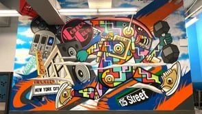
Collaborated with local artists to creatively interpret Blink Fitness in relation to its unique 5 locations in the New York area.
The murals convey a sense of unity, celebration, and inclusivity, incorporating subtle elements of fitness achievement and boldness.
Creative Director
These are just a few examples of the types of paid ads and emails that I’ve creative directed and made to make them eye-catching, well-crafted but FUN promotional messages designed to engage and inspire.
Associate Creative Director
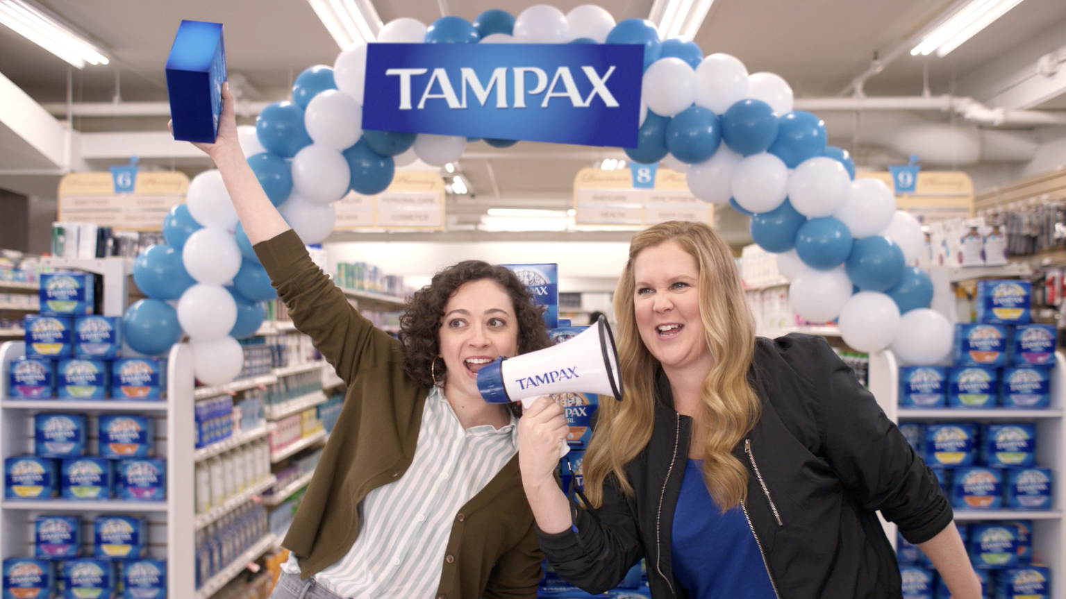
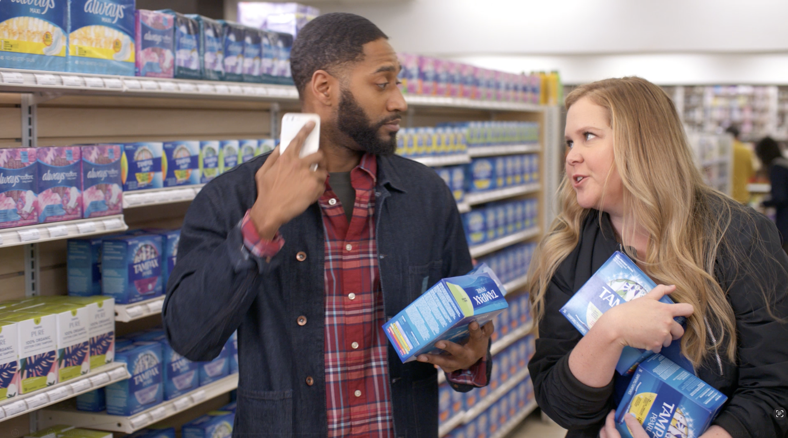
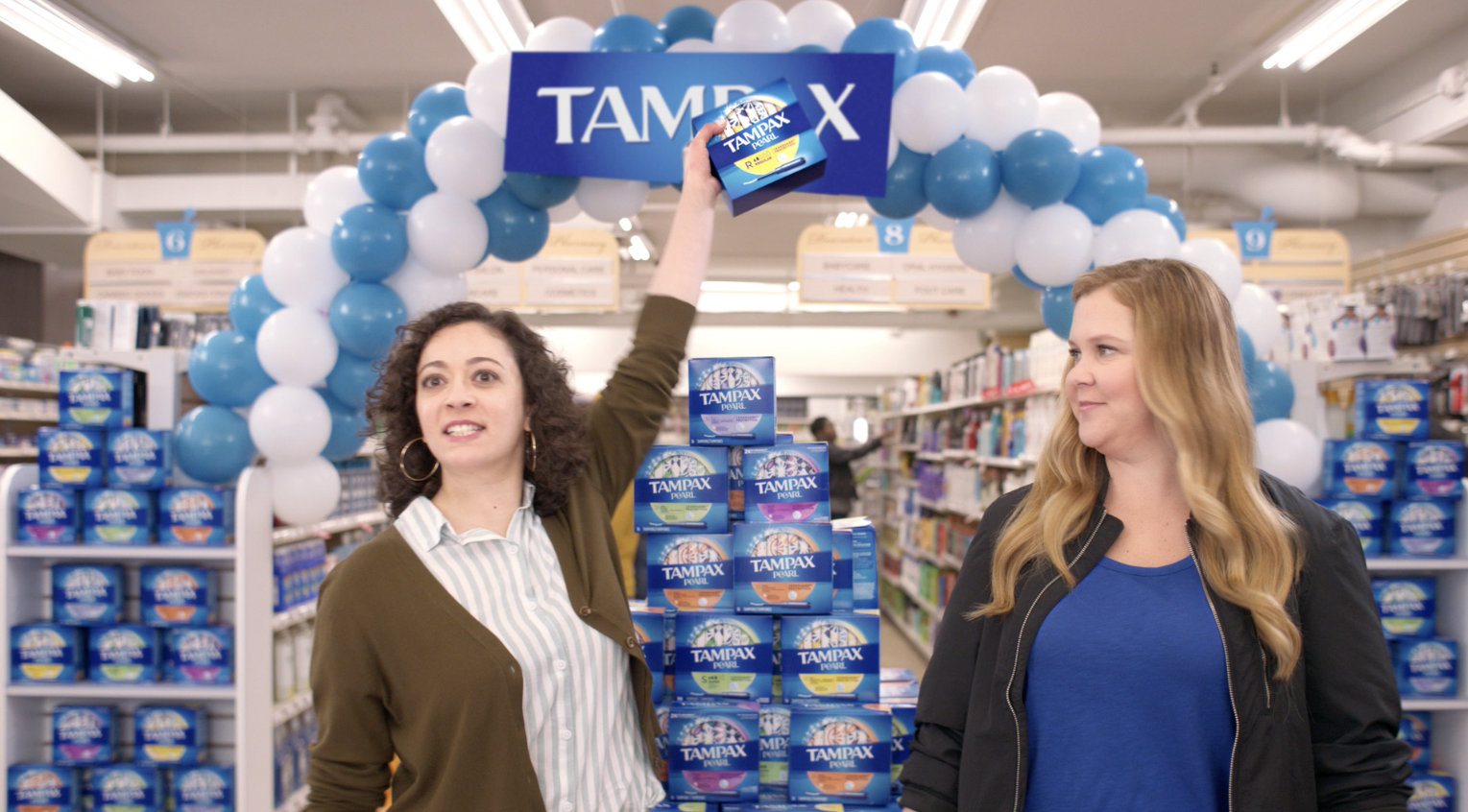
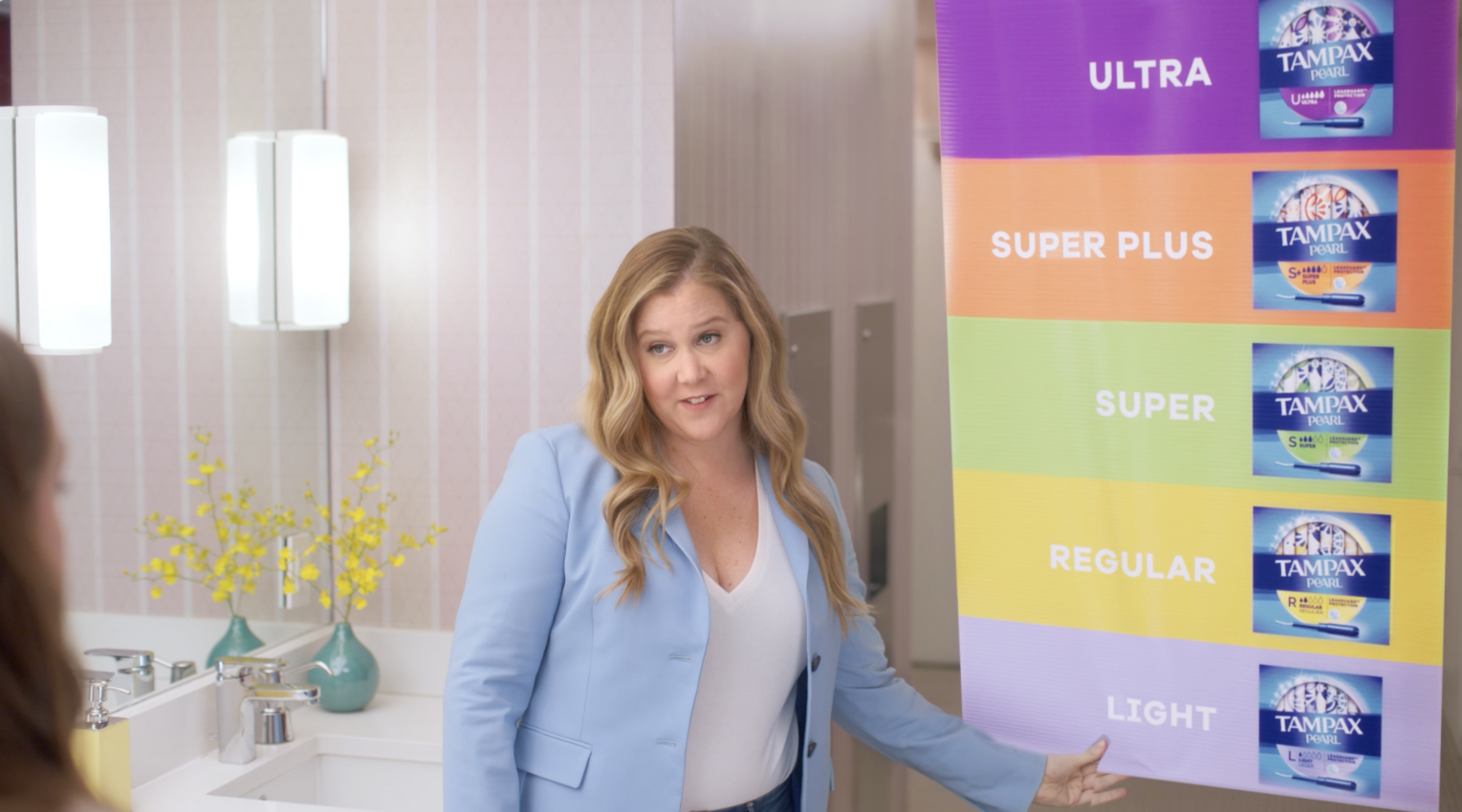
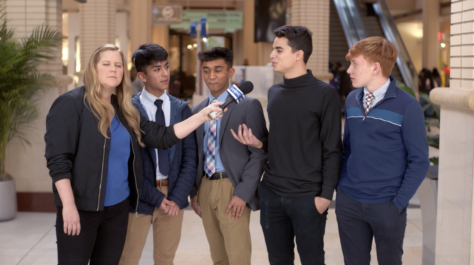
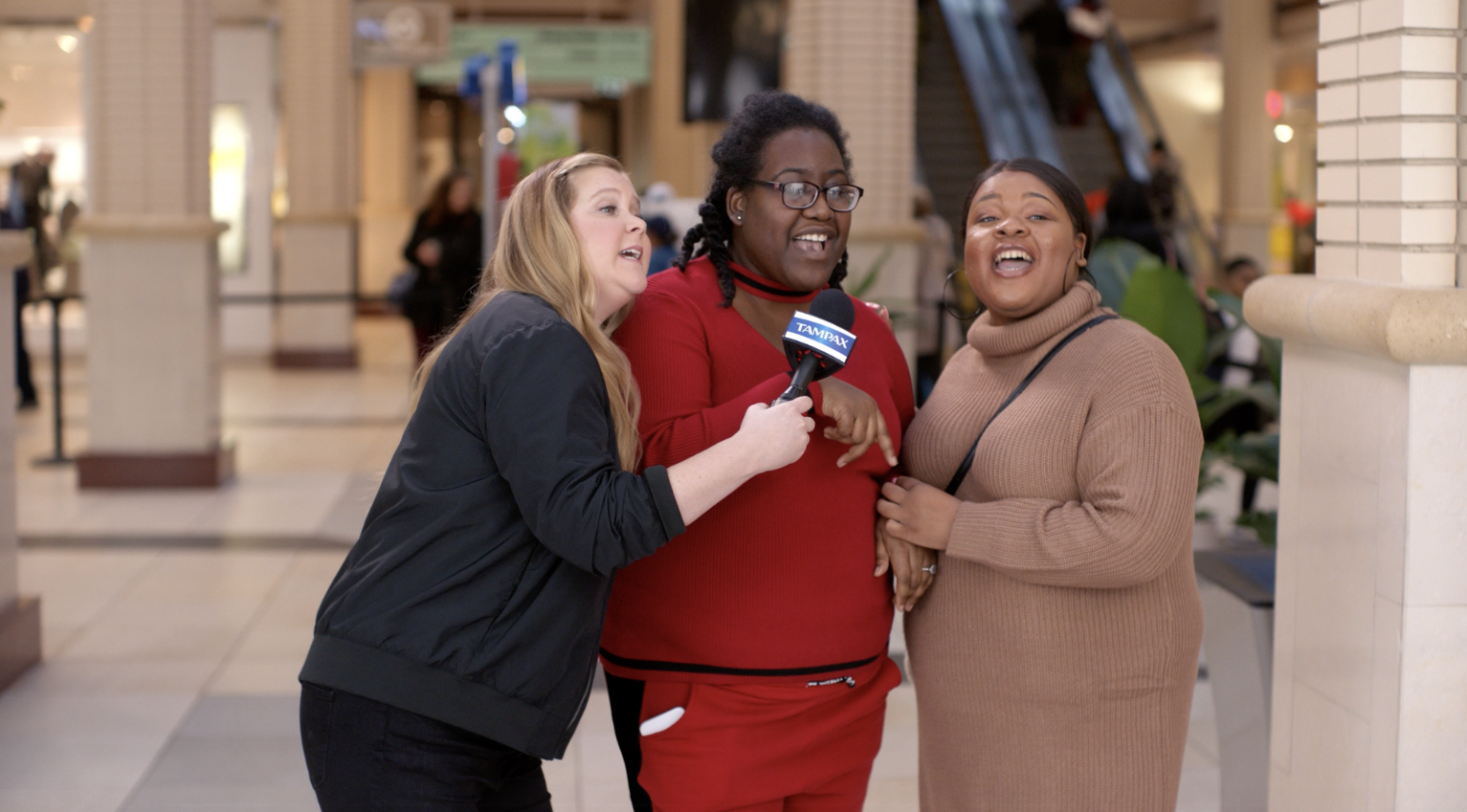
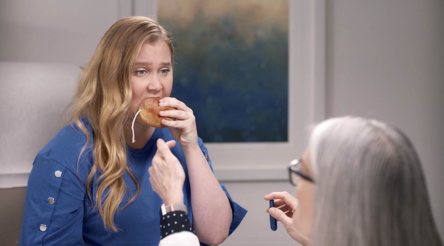
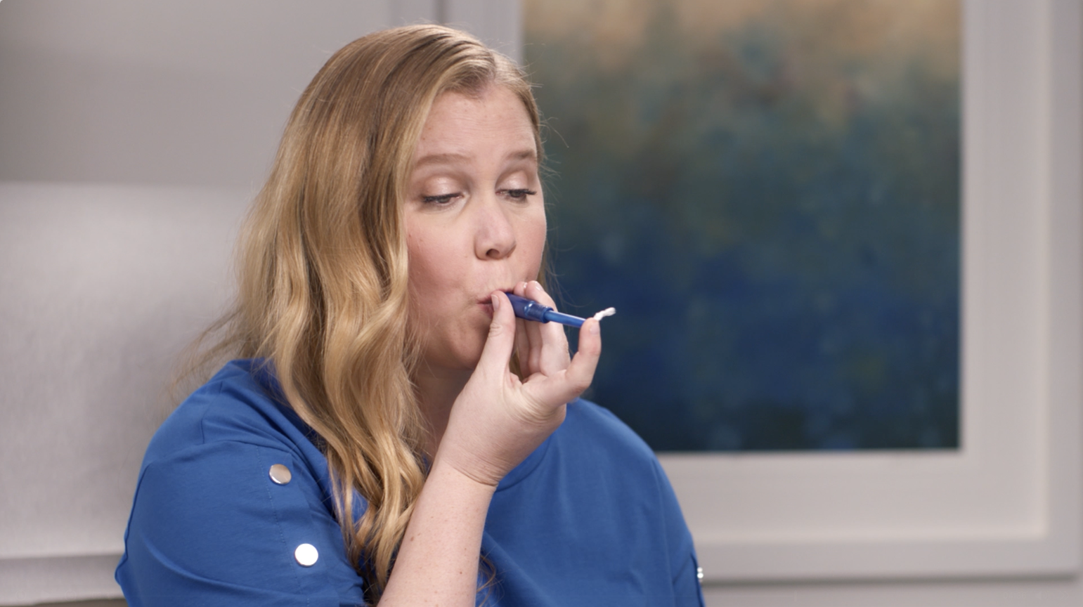
For 5 years running, tampon sales were tanking. We dug in and found that period stigma has led to period misinformation...when we don’t talk about it, we can’t learn about it. After all of our research, we were confident that education was the answer. And who better to shed light on this issue than the queen of vagina-talk, Amy Schumer.
This Amy campaign won a silver Effie for most effective advertising in the Personal Care category.
Associate Creative Director/ Design Lead
I specifically was tasked with creating a fresh new look for Tampax and its sub-brands. After some exploration, I landed on the circle, a subtle nod to the shape of a period and a deliberate move away from the brand’s traditionally boxy logo. I used the circle not just symbolically, but also as a holding device for the main visual elements, creating a cohesive and modern look. I also refreshed the color palette, making it bolder and brighter to help each sub-brand stand out. This new visual identity was then tested across various formats, including TV and print, as shown in these examples. The final look was adopted and is still in use today.
Associate Creative Director
Gen Z VERY RARELY use tampons. And when they do, it’s only for very specific moment.
Through :06 bumpers, we found a fun, eye-catching way to get
Gen Zers to consider Tampax any time they have a period.
Illustrator: Ayushi Saria
Senior Art Director
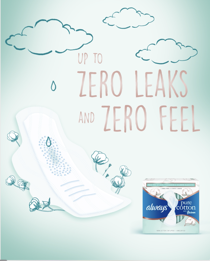
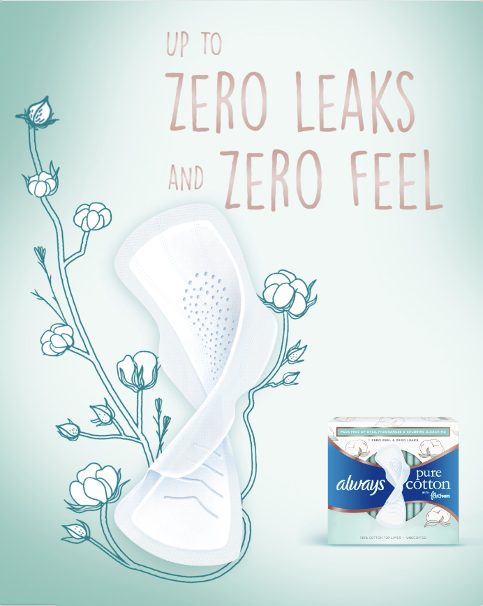
At times, each of us has wanted to return to a simpler state. And that’s exactly what we did with new Tampax and Always PURE. It’s the protection you love down to the bare essentials – tampons with 100% organic cotton core, free of dyes, fragrances and chlorine bleaching.
Associate Creative Director
A fresh visual identity was essential to authentically represent our target audience: a multi-faceted woman. I conceptualized this distinctive look and worked closely with our design team to bring it to life. We call this visual identity "Collage" because it reflects the authenticity, creativity, and vibrancy of our audience. It's a curated collection of print work that, much like the women it represents, is unique and full of character.
Associate Creative Director
Always Mainline just got a modern makeover! With a fresh, clean new look, we’re challenging everything she thought she knew about Always pads because this isn’t just a revamp, it’s the best pad on the market.
Associate Creative Director
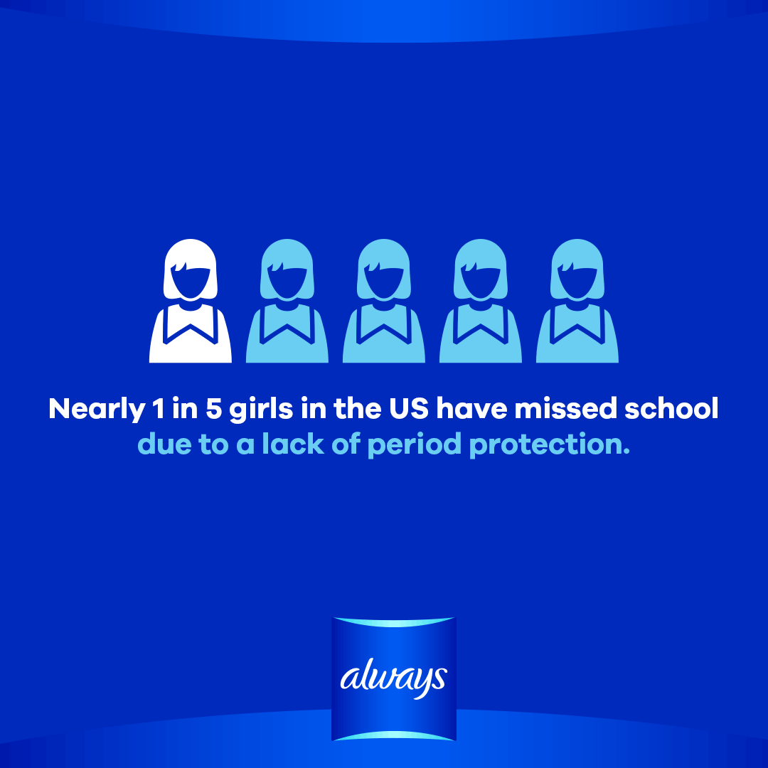
All around the world, millions of girls drop out of after school activities each year because of period poverty, which is when girls and women lack access to sanitary products. This causes girls to miss out on the opportunities that can help mold their future. We got the message out through this video and by donating pads to girls in need.
Taking it a step further, what better way to break period stigma than by wrapping the basket in Always packaging, boldly signaling to all young women that periods are nothing to be ashamed of, while also keeping Always top of mind.
Senior Art Director
I transformed the packaging into the creative. By art directing and illustrating the concept, I showed how product claims alone could become visually compelling, scroll-stopping social content.
Associate Creative Director
These print advertisements for Always flexfoam effectively convey the message that you can continue your daily activities even during your period with a pad this light and flexible. The standout feature of these visuals is their use of repetition to depict movement, which not only creatively illustrates the concept but also aligns with design trends.
Senior Art Director
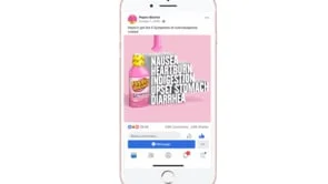
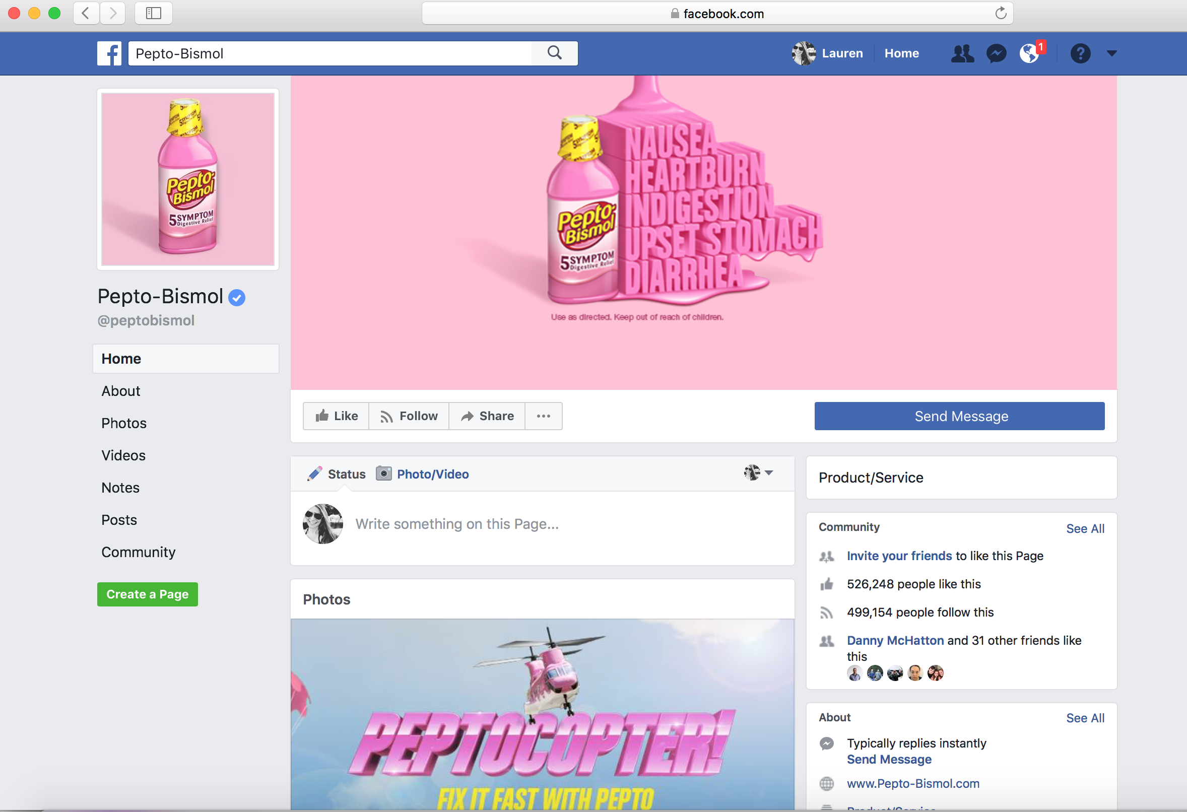
Pepto-Bismol achieved remarkable success with its "Symptom Singing" commercial in 2009, which became a defining moment in the brand's history. During that time, sales reached their peak, as the commercial resonated deeply with audiences and became a memorable part of pop culture.
Fast forward to today, and we were tasked with reviving this iconic jingle in a fresh, modern way while maintaining the humor and charm that made it so memorable. Our goal was to create a version that would not only capture the original spirit but also stand out in today's advertising landscape. The result was a commercial that performed exceptionally well in testing and significantly boosted sales, proving that the classic song still holds a special place with consumers.
Senior Art Director
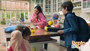
We were given the challenge of crafting a scenario that children with tummy aches could relate to. With Pepto Kids, parents have a quick and effective solution to ease their kids' discomfort, even in the midst of stressful moments or busy mornings. I also art-directed the animation to feature dynamic, fun-type movement, making it more engaging and impactful for young audiences
Senior Art Director
Red Lobster hosts a seafood event every other month, and while the brand's advertising has traditionally focused on showcasing its food, consumer feedback from multiple rounds of testing revealed a critical insight: there was nothing new or exciting about Red Lobster that compelled them to keep returning.
We were tasked with revitalizing and modernizing Red Lobster's current campaign. By incorporating innovative sound design, dramatic visuals, and dynamic lighting, we created spots that were truly groundbreaking for the casual dining category. These elements not only captured attention but also shifted consumer perceptions, encouraging them to see Red Lobster in a fresh, exciting light.
Because Red Lobster has always been committed to protecting & conserving the source of their seafood, they’ve decided to partner with Seafood Watch. We created a social video to show how deep Red Lobster’s commitment really is.
Senior Art Director
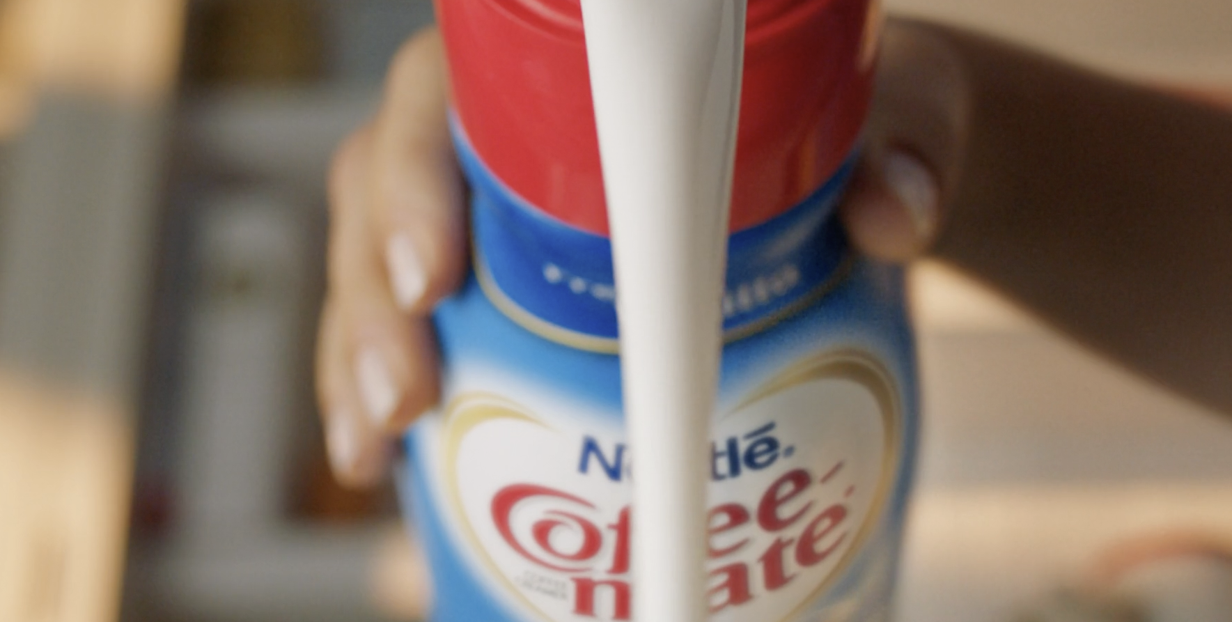
Coffee-mate set out to reinvent its iconic coffee swirl—the perfect blend of coffee and Coffee-mate. In this campaign, we put the swirl at the forefront, showcasing it in a dramatic and captivating way. Collaborating closely with a talented animation studio, we reimagined and emphasized this beautiful coffee combination, drawing attention to its smooth, irresistible allure.
Art Director
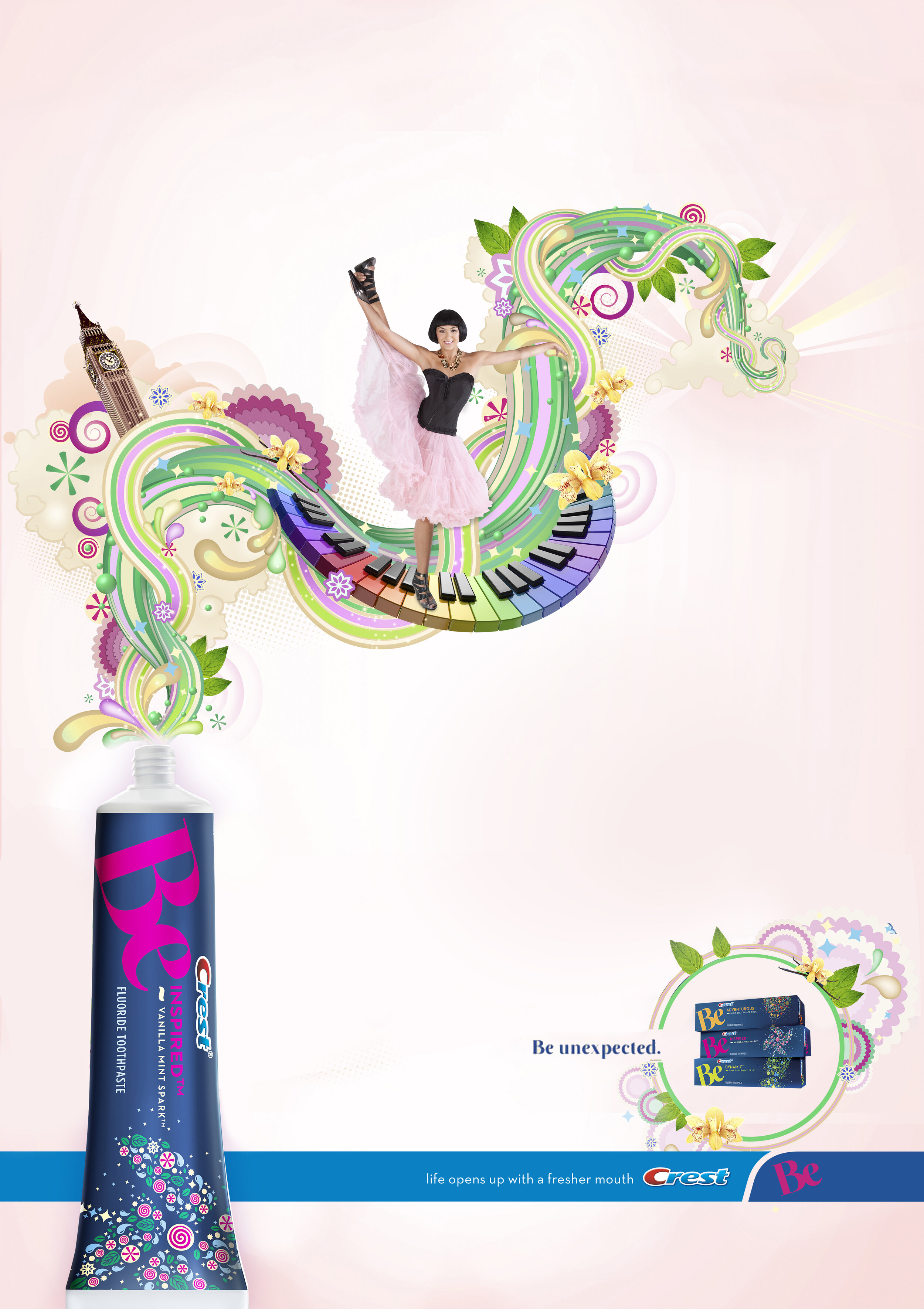
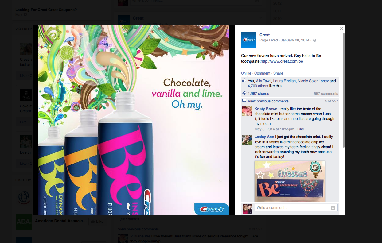
Crest launched a new line of toothpaste flavors under the name "Be," featuring bold and unconventional flavors like Chocolate, Vanilla, and Lime Mint. To match the unique appeal of these flavors, the campaign needed to be fun, daring, and eye-catching. It went beyond the typical boundaries of the oral care category and was even recognized by Workbook for its innovative illustrations and art direction.
The stunning illustrations were created by the talented team at AKA, adding a distinctive, artistic touch to the campaign.
Art Director
There's an assumption that whitening your teeth causes weak enamel. Not true with Crest 3D White's Diamond Strong mouthwash and toothpaste. It's technology actually helps strengthen your teeth as you whiten.
We created Print ads that communicate strength and beauty with
3D White.
Art Director
Parents have always struggled to get their kids to brush their teeth. But with the partnership between Disney and Oral-B, they created an app that makes this challenge much easier for parents. This educational video highlights the excitement kids feel when using the app, turning brushing into a fun and engaging experience.
For "May the 4th," we aimed to create a captivating video that would showcase our kid-friendly "Star Wars" products on Facebook. By tapping into the iconic concept of the Force, we crafted an eye-catching video that made our Crest and Oral-B products impossible for followers to scroll past in their newsfeeds.
"Star Wars Day," or "May the 4th," has become a must-celebrate event for Star Wars fans and Facebook brands alike. On this day, brands compete to cleverly integrate their products with Star Wars themes, hoping to go viral on Facebook. We joined in by creating poster-style graphics of our favorite Star Wars characters, but what we love most about our take on them are their smiles—adding a fun, unexpected twist to the iconic characters.
With each brand I've collaborated with, my design expertise has expanded. While I'd love to showcase every project (even personal ones) from my 15+ years in the industry, it's simply not feasible. Nonetheless, here are a few highlights that truly resonate with me.
Associat Creative Director
These print ads for Cascade showcase how the dishwasher can handle the cleaning, allowing you to focus on what matters most. With Cascade's superior cleaning power, you can trust your dishwasher to do the heavy lifting.
Graphic Designer
"Hilton" wanted to reward its Honor members with a deck of playing cards that featured their hotels around the world. The cards brought awareness of Hilton Hotels located all over. Each card was specifically designed with a different country on it and included unique-detailed graphics.
Art Direcor
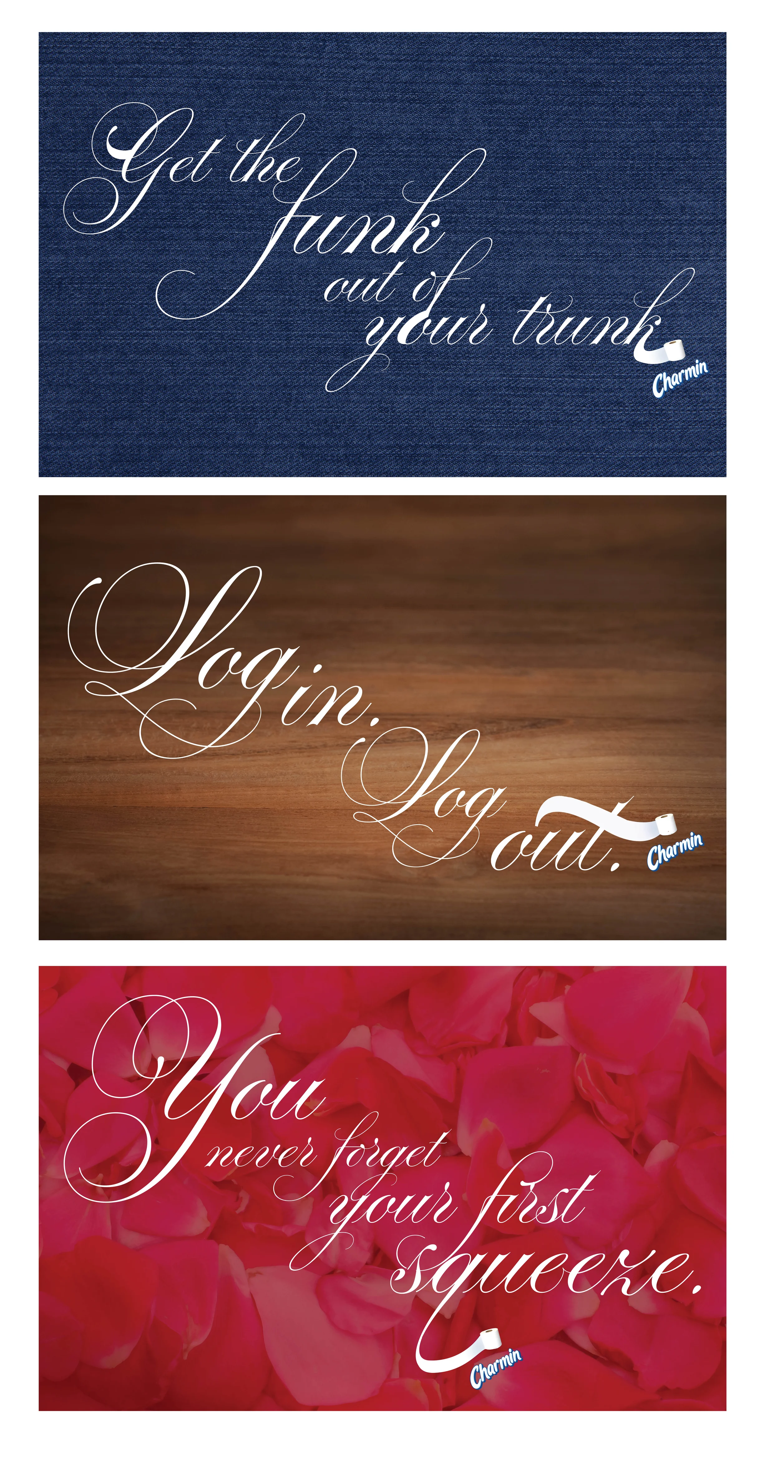
Charmin challenged us to imagine the brand without its iconic bear, leaning into visually clever, cheeky bathroom humor to keep Charmin top of mind in a bold and memorable way. Here is an exploratory.
Art Director
Nestea challenged us to create lifestyle-focused print and OOH that captured living in the moment while stripping away the clutter and bringing it back to simple, honest ingredients.